
Table of Contents
One of the most common questions designers and print buyers ask is RGB vs. CMYK—and why printed colors don’t always match what they see on their computer screen.
The answer comes down to how color is created. Digital screens display images using light, while commercial printing presses reproduce color using ink. Understanding RGB vs. CMYK can help ensure your printed materials reproduce as expected, reduce costly surprises, and improve color consistency from design through production.
RGB vs. CMYK: What’s the Difference?
Although RGB and CMYK both represent color, they are designed for two very different purposes.
RGB (Red, Green, Blue) is used for digital displays such as computer monitors, smartphones, tablets, and televisions. These devices create color by combining red, green, and blue light directly seen by your eyes.
CMYK (Cyan, Magenta, Yellow, Black) is the color model used in commercial printing. Printing presses create color by layering these four ink colors on paper, reflecting light off the substrate, then through the ink and into your eyes.
Because screens emit light and printed materials reflect light, the range of colors each can produce is different. This is why colors often appear more vibrant on a monitor than they do in print.
| RGB | CMYK |
| Used for screens | Used for commercial printing |
| Uses light | Uses ink |
| Larger color gamut | Smaller printable color gamut |
| Best for websites and digital media | Best for brochures, catalogs, packaging, and printed marketing materials |
| Bright, vibrant colors | Optimized for accurate printed reproduction |
What Is RGB?
RGB stands for Red, Green, and Blue.
It’s the color mode used by digital devices such as computer monitors, smartphones, tablets, and televisions. These devices create color by combining direct light, allowing them to display a much wider range of bright, vibrant colors than can typically be reproduced with ink.
Every website, social media graphic, digital advertisement, and presentation you view on a screen is displayed in RGB.
Because RGB has a larger color gamut, many colors appear brighter and more saturated than they can be reproduced in print.
What Is CMYK?
CMYK stands for Cyan, Magenta, Yellow, and Black.
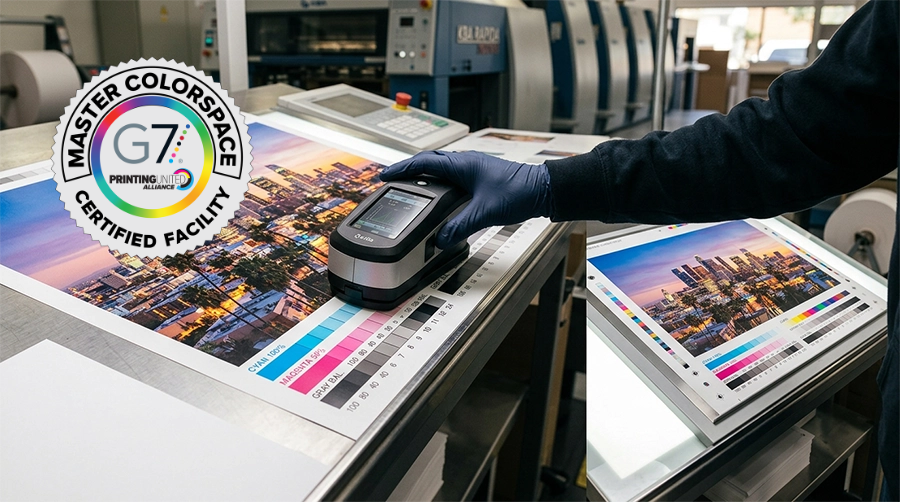
Professional printing presses reproduce color by layering these four ink colors in different percentages to create the final image.
Commercial printing methods, such as HUV offset printing, are designed to reproduce consistent, high-quality color across a wide range of printed materials.
When viewing printed products, you’re actually seeing reflected light bouncing off the paper. Because light is reflected rather than emitted, the printable color range is smaller than what you see on a digital display.
Some bright blues, greens, oranges, and fluorescent colors that appear vivid on screen simply cannot be reproduced exactly with standard process inks.
This is why artwork often appears slightly different once it’s printed.
Why Doesn’t My Printed Piece Match My Monitor?
Many people assume their monitor is showing the “correct” version of a design.
In reality, every monitor displays color a little differently. Brightness settings, display technology, calibration, and ambient lighting all affect what you’re seeing.
Professional designers often use calibrated monitors to improve consistency, but even then, a printed piece will never be an exact match to a backlit screen.
The goal isn’t to make print look like a monitor. It’s to produce accurate, consistent color within the capabilities of the printing process.
When Should You Convert to CMYK?
If your project will be professionally printed, it’s always a good idea to speak with your print service provider before converting your files.
The output device, paper stock, printing process, and color conversion profile all affect how colors reproduce. Your printer can recommend the best workflow for your specific project.
Working in CMYK allows you to see how colors are likely to reproduce before production begins, reducing surprises later.
Converting an RGB file to CMYK at the last minute may cause certain colors to shift unexpectedly, especially bright blues, greens, and oranges.
Planning ahead gives designers more control over how those colors will appear in the final printed piece.
What About ICC Color Profiles?
An ICC profile is a standardized way of describing how colors should be interpreted by different devices.
Color profiles help create consistency between monitors, proofing systems, and printing equipment by providing a common color reference.
Different printing conditions may require different profiles depending on the paper, printing process, and production specifications.
Rather than relying on a single “best” profile for every project, it’s important to use the profile that’s appropriate for the specific printing conditions.
If you’re unsure which profile to use, your printer can usually provide guidance before production begins.
Should I Design in RGB vs. CMYK?
The answer depends on where the artwork will be used.
If the design is intended only for websites, social media, presentations, or digital advertising, RGB is the correct choice because those platforms display color using light.
If the final product will be professionally printed—such as brochures, catalogs, packaging, annual reports, or marketing materials—CMYK should be part of your production workflow.
Many designers begin creative work in RGB vs. CMYK because RGB offers a broader color range, then carefully convert and adjust the artwork for print before final production.
Other Factors That Affect Printed Color
Color mode is only one piece of the puzzle.
Several other factors influence how printed colors appear, including:
- Paper type and finish
- Coated versus uncoated stock
- Ink density
- Lighting conditions
- Image quality and resolution
- Printing process
- Press calibration
Two pieces printed with identical CMYK values can still appear slightly different if they’re produced on different papers or using different printing methods.
This is why proofing remains an important part of the production process.
Why Proofing Matters
Even when artwork is prepared correctly, reviewing a proof before production provides one final opportunity to verify color, layout, typography, and overall appearance.
A good proof allows everyone involved to confirm expectations before the project reaches the press.
For projects where color consistency is especially important—such as brand materials, investor communications, museum graphics, or high-end marketing collateral—this step can make a significant difference in the final result.
Frequently Asked Questions
Can I send an RGB file?
Yes, but your printer will typically convert it to CMYK before production. Depending on the colors used, this conversion may result in noticeable color shifts. Whenever possible, discuss file requirements with your print service provider before submitting artwork.
Why do printed colors look less vibrant than my monitor?
Computer monitors emit light, while printed materials reflect light. Because RGB has a larger color gamut than CMYK, some colors simply cannot be reproduced exactly with standard printing inks.
Should my logo be RGB vs. CMYK?
Most businesses should have both RGB and CMYK versions of their logo. RGB is used for digital applications, while CMYK is intended for professional printing.
Can CMYK reproduce every RGB color?
No. RGB includes a wider range of colors than CMYK. Some highly saturated blues, greens, oranges, and fluorescent colors cannot be reproduced exactly with process inks.
Final Thoughts
Understanding RGB vs. CMYK is one of the easiest ways to improve the quality of your printed materials.
RGB is ideal for digital displays, while CMYK is designed for professional printing. Using the correct color mode, selecting the appropriate ICC profile, and reviewing proofs before production all contribute to a finished piece that accurately represents your original design.
Whether you’re printing brochures, annual reports, presentation folders, packaging, or marketing materials, working with your print provider early in the design process helps ensure accurate color conversion, consistent reproduction, and professional results from press to final delivery.