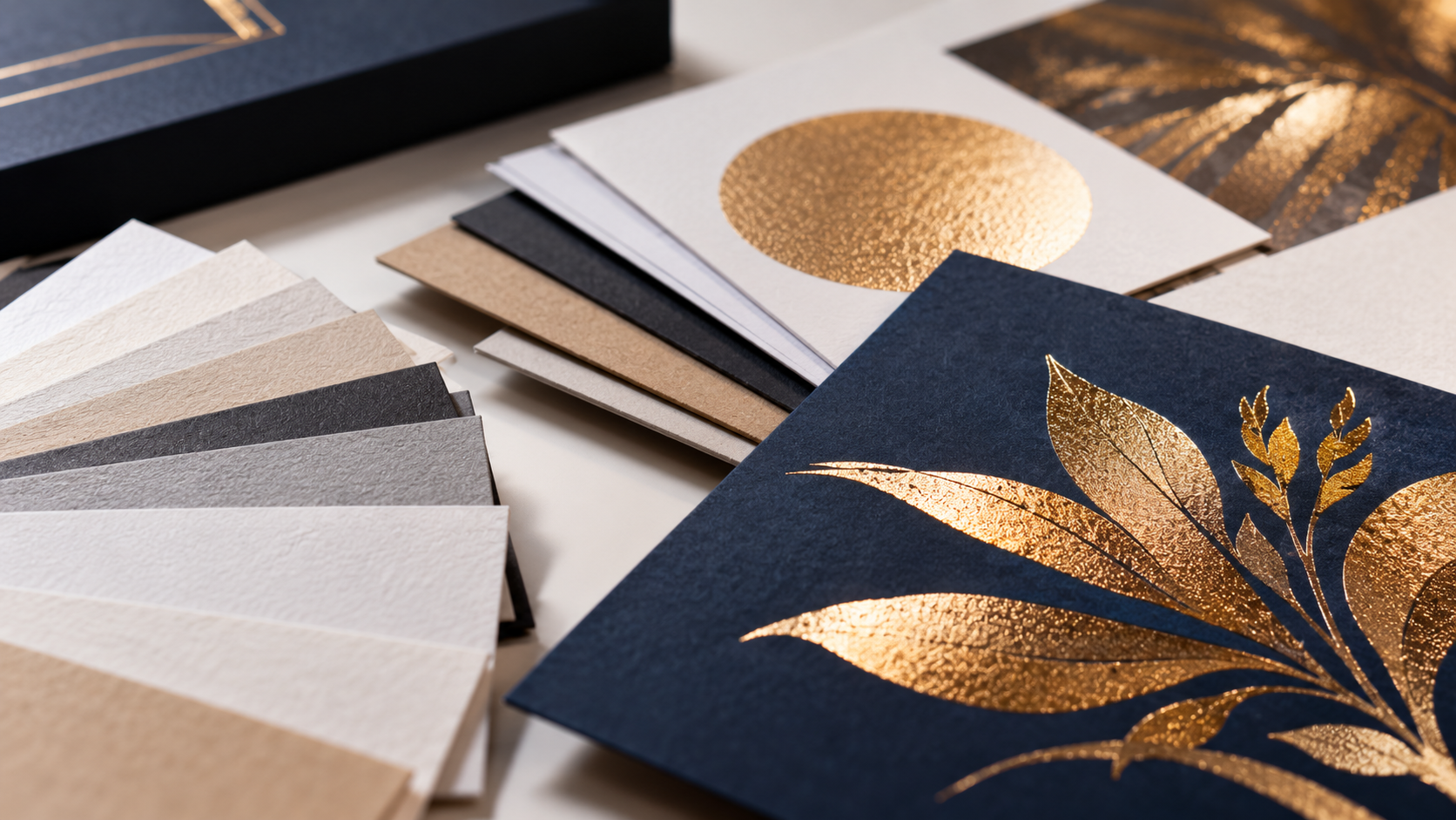

Metallic ink printing can add depth, dimension, and visual interest to an otherwise ordinary printed piece. Gold, silver, bronze, copper, and custom metallic colors can make packaging, invitations, annual reports, book covers, and other premium materials feel more distinctive.
However, choosing the metallic ink is only part of the process.
The paper you select can have just as much influence on the final appearance of metallic ink printing.
The paper beneath the ink has a significant effect on how the finished color looks. The same metallic ink can appear bright and reflective on one stock, then softer and more understated on another.
Understanding how paper and metallic ink interact helps designers and print buyers select the right materials and achieve a finished result that supports the original creative vision.
What Is Metallic Ink Printing?
Unlike standard process inks, metallic inks contain reflective metallic pigments. These particles reflect light and create an appearance that cannot be fully replicated with conventional CMYK printing.
Metallic inks are generally more opaque than standard process inks, but the paper beneath them can still influence their color, brilliance, and overall appearance.
Metallic ink printing is commonly used for:
- Luxury packaging
- Presentation folders
- Book and catalog covers
- Annual reports
- Invitations
- Product literature
- Marketing collateral
- Premium brand materials
- Museum and exhibition materials
The effect can range from subtle and sophisticated to bright and dramatic, depending on the ink, artwork, paper, and finishing choices.
Why Paper Matters in Metallic Ink Printing
Metallic ink does not exist in isolation. It sits on the surface of the paper, and the characteristics of that surface influence how effectively light reflects back to the viewer.
Several paper properties can affect metallic ink printing:
- Coating
- Smoothness
- Texture
- Brightness
- Color
- Absorbency
Choosing the right stock is just as important as selecting the right metallic ink. Designers should consider the paper and ink together instead of treating them as separate production decisions.
Metallic Ink on Coated Paper
Coated paper typically produces a brighter and more reflective metallic appearance.
Because coated stocks absorb less ink, more of the metallic pigment remains near the surface. This allows the reflective particles to interact with light more effectively.
Metallic ink printing on coated paper may provide:
- Greater brilliance
- More noticeable shimmer
- Cleaner details
- More uniform coverage
- Stronger contrast
- Sharper metallic patterns and typography
A smooth coated sheet is often a strong choice when the goal is maximum metallic impact. It can work especially well for luxury marketing materials, product packaging, book covers, and promotional pieces designed to attract immediate attention.
The exact result will still depend on the paper, ink formulation, artwork, ink coverage, and printing conditions.
Metallic Ink on Uncoated Paper
Uncoated paper creates a different metallic appearance.
Because an uncoated sheet is generally more absorbent, metallic ink can settle farther into the paper surface. Instead of producing a highly reflective finish, the ink may appear softer, warmer, or more understated.
This is not necessarily a disadvantage.
Many designers intentionally choose metallic ink printing on uncoated paper for projects that need to feel tactile, sophisticated, natural, or handcrafted. A restrained metallic effect may complement the character of a premium uncoated sheet more effectively than a bright, polished result.
Uncoated stocks can be appropriate for:
- Museum publications
- Boutique brand materials
- Invitations
- Art books
- Editorial projects
- Premium corporate collateral
When printing metallic ink on uncoated stock, it is important to set expectations appropriately. The result may be elegant and distinctive without producing the same brilliance as metallic ink on a coated sheet.
How Paper Texture Changes Metallic Ink
Paper texture can have a noticeable effect on metallic ink printing because it influences how evenly the metallic pigment sits on the surface.
A smooth sheet generally produces cleaner and more uniform metallic coverage. It can help fine details, thin lines, patterns, and typography remain crisp.
A heavily textured stock creates natural variations across the printed surface. Metallic ink may settle differently into the peaks and valleys of the paper, producing a more organic appearance.
Neither approach is inherently better. They create different visual and tactile experiences.
Before selecting a textured sheet, consider:
- The size of the metallic elements
- The amount of fine detail in the artwork
- Whether uniform coverage is important
- How subtle or dramatic the effect should be
- Whether the texture supports the overall brand aesthetic
Fine metallic type or intricate linework may require a smoother sheet than a large, simple graphic.
How Paper Color Influences Metallic Ink
White is not the only option for metallic ink printing. Metallic colors can also be printed on cream, natural, gray, black, and other colored papers.
The color of the sheet can influence the perceived tone and contrast of the metallic ink.
For this reason, paper color should be considered early when planning a metallic ink printing project.
Metallic inks are usually more opaque than process inks, but they may not completely eliminate the influence of the substrate in every application.
A bright white stock may produce a clean, contemporary result. A warm natural sheet can give gold, bronze, or copper inks a softer character. Dark paper can create dramatic contrast, although the exact ink coverage and visibility should be tested.
The surrounding printed colors matter as well. Dark process-color backgrounds can make metallic elements appear brighter, while lighter compositions may create a quieter and more refined effect.
The Size of the Metallic Elements Matters
Metallic ink does not look identical across every design element.
A large solid area reflects light differently from fine type, a thin rule, or an intricate pattern. Small metallic elements may appear more restrained, while larger areas give the reflective pigment more room to become visible.
When designing with metallic ink, consider how it will be used in:
- Headlines
- Logos
- Fine typography
- Decorative patterns
- Large solid areas
- Borders
- Backgrounds
- Illustrations
Fine type and delicate details should be evaluated carefully, particularly when printing on an absorbent or textured stock.
Metallic Ink vs. Metallic Foil
The Metallic ink and metallic foil can both add reflective elements to printed materials, but they create different effects.
Metallic ink is printed onto the sheet and integrates naturally with the surrounding artwork. It can work well for large printed areas, fine patterns, illustrations, and projects that call for a refined metallic appearance.
Foil is applied as a separate material and typically produces a brighter, smoother, and more mirror-like finish. It may be selected when maximum reflectivity or a particularly sharp decorative accent is required.
The right option depends on:
- The desired level of reflectivity
- The artwork
- The paper stock
- The production quantity
- The budget
- The intended use of the finished piece
A commercial printer can help determine whether metallic ink, foil, or another specialty treatment is best suited to the project.
Finishing Can Change the Metallic Effect
Metallic inks can be combined with finishing techniques to add contrast, texture, and visual interest. However, coatings and finishes may also change the ink’s reflective appearance.
For example, a matte or soft-touch coating may produce a more subdued metallic effect. A carefully placed gloss treatment may create stronger contrast between metallic and nonmetallic areas.
Depending on the project, metallic ink may be combined with:
- Embossing or debossing
- Die cutting
- Specialty varnishes
- Spot UV
- Selected coatings
- Premium paper stocks
The ink, paper, coating, and finishing requirements should be planned together. Compatibility testing may be recommended before production begins.
Learn more about Colornet Press’s finishing and binding capabilities.
Why Physical Testing Matters
The full appearance of metallic ink cannot be accurately represented on a monitor or conventional digital proof. A screen does not reproduce the way metallic pigments reflect light.
For color-critical projects, a physical ink drawdown or printed sample on the intended paper may be recommended. This allows designers and print buyers to evaluate how the ink and stock interact before full production begins.
Testing is especially valuable when a project involves:
- Colored paper
- Textured stock
- Fine metallic details
- Large metallic areas
- Additional coatings
- Critical brand requirements
A small change in the stock or finishing selection can significantly affect the finished appearance.
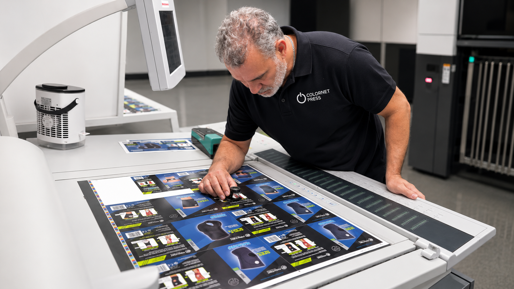
A press check may also be appropriate for particularly important or technically demanding projects.
How to Choose the Right Paper for Metallic Ink
There is no single best paper for every metallic ink printing project. The right combination depends on what the printed piece needs to communicate.
A luxury retail brand may want a brilliant metallic color on a smooth coated sheet. A museum exhibition catalog may benefit from a restrained metallic effect on premium uncoated paper. A corporate annual report may require a balance of sophistication, readability, and consistent reproduction.
Before choosing a stock, ask:
- Should the metallic effect be bright or understated?
- Will the artwork use fine details or large solid areas?
- Is a smooth or tactile surface more appropriate?
- Will the project include coatings or additional finishing?
- Does the paper color support the desired metallic tone?
- Is a physical sample or ink drawdown needed?
The answers help narrow the options and guide production decisions.
Frequently Asked Questions About Metallic Ink Printing
Does metallic ink look better on coated or uncoated paper?
Metallic ink generally appears brighter and more reflective on coated paper because less ink is absorbed into the sheet. Uncoated paper usually creates a softer and more understated effect. The better option depends on the intended look.
Can metallic ink be printed on dark paper?
Metallic ink can be used on dark paper, but visibility and coverage depend on the specific ink, stock, artwork, and printing process. A physical test may be recommended before production.
Can a PDF proof show what metallic ink will look like?
No conventional PDF or monitor can accurately reproduce the reflective quality of metallic ink. A physical sample, ink drawdown, or other printed proof may be needed to evaluate the actual effect.
Is metallic ink the same as foil?
No. Metallic ink contains reflective pigments and is applied during printing. Foil is a separate material that typically produces a brighter and more mirror-like appearance.
Can metallic ink be coated?
Metallic ink may be compatible with selected coatings, but a coating can change or reduce its reflective appearance. The ink, coating, paper, and production process should be evaluated together.
Plan Your Metallic Ink Project With Colornet Press
Metallic ink printing can transform a printed piece by adding dimension, character, and visual impact. However, the ink alone does not create the effect.
Paper plays an equally important role in determining how metallic color reflects light, how it feels in the hand, and how the finished piece represents the brand.
Selecting the ink, paper, artwork, and finishing options together helps create a more cohesive result and reduces production surprises.
Planning a project that uses metallic ink? Colornet Press can help you compare paper, ink, and finishing options before production begins.
Request a quote to discuss the look you want to achieve.